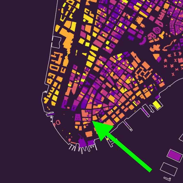
Kieran Healey – a man who does some truly fascinating things with sociology, data visualization, and the intersection between sociology and data visualization – some years ago used the data available from the NYC government’s open-data policy to make a map of the ages of building in the city. Here’s Manhattan, with new buildings in bright yellow and most of OSE’s projects in purple (get the full size image at the link by clicking on the map):

Here’s our office in the light purple indicating the 1930s:


You must be logged in to post a comment.