From a recent trip on an R train, the new subway map:

except it’s not a map. It’s a diagram. As difficult as it may be to believe, all of New York is not made up of 90 and 45 degree angles. I’ve got to start somewhere with the tangled history behind the new map, so:
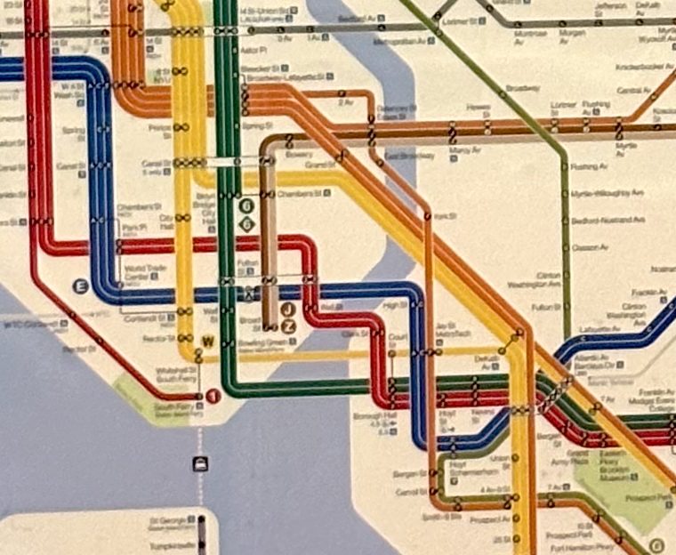
- No New York subway map has ever been remotely accurate as a map of the city. They all have distorted the geography in various ways, most consistently by making Manhattan appear much bigger than it is compared to the other boroughs. The reason for the distortion is simple: every train line and every station requires some amount of labelling, and there’s a minimum size text that can be used and still have the thing be legible. So the areas with more lines get bigger to provide room for the labels, and the areas with no subway service shrink. The result is a distortion that New Yorkers barely notice any more because every subway map has had this distortion in a similar way.
- The system is a tangle, partly because it’s a combination of three partly cooperating, partly competing systems. Each of those systems has two or more trunk lines in Manhattan with a bunch of branches in Queens, Brooklyn, and/or the Bronx. So two lines may share trackage in one borough but not in another. Thanks to some mid-1900s connecting links, two of the three systems (the BMT and the IND) can partly share trunks between their branches.
- There is, in public graphic design, a fight between people who want traditional design (which they often mistake for realism) and people who want simplified design (which they often mistake for futurism). The NASA “meatball versus worm” fight is the classic example.
So…New York had a series of vaguely traditional subway maps, with the usual distortion, through the 1940s. The city, which had built the IND system, bought the IRT and BMT in 1940. The three systems were only really merged after control was passed from the city to the Transit Authority in 1953. The first geometric-diagram map came out in 1958 and – amazingly – did not immediately untangle the mess.
In 1970, the TA hired Unimark to redesign the map along with wayfinding and signage through the system. The signs in use today are still very much based on the Unimark system. The reorganization included renaming the lines to create consistency. Because, like most people, I remember things the way I first learned them, there is some small part of my brain that thinks of the R train as the EE or the RR, because in the Unimark system locals had double-letter names and expresses had single-letter names. The Unimark map was designed mostly by the firm partner Massimo Vignelli, and has been known since its 1972 debut as the Vignelli map. It was widely hated and widely loved…and in 1979 was replaced by yet another traditional map that was used until this year, when a modernized diagram was introduced.
The new map has parks as green rather than the Vignelli gray, and water as blue rather than beige. Lines do not have their own colors as they did with Vignelli: the system introduced in 1979, where colors are based on which Manhattan trunk a line uses, remains. Connections and the distinction between local and express stops are more clearly shown. But from a distance, this is the Vigenlli map come back to life more than anything else.
* I was considering calling this Vignelli’s Revenge, but that seemed like too much of an inside joke for the title.


You must be logged in to post a comment.