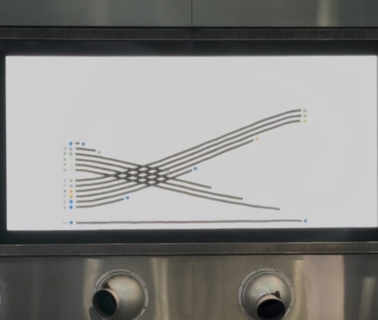
Thanks to Johnny Decimal, I learned about a short video on the subway currently playing on the hour on the various video screens in the Fulton Center. That video, “A Data Love Letter to the Subway” was created by pentagram for the MTA and presents some of the history of the subway and a bunch of statistics about it in the form of animated snakelike lines.
Here’s a still:

To put that photo in context, here’s the wall in Fulton Center with the video screen:

To put that photo in context, here’s the interior of the Fulton Center, with the subway entrance on the left and the “Sky Reflector-Net” above. I think of it as a conical dome, but it’s probably more accurate to call it a work of art posing as a skylight.

And finally, to put the interior in context, here’s the Fulton Center’s Broadway facade, with the Corbin Building on the right.

The center is not really a new station: it’s a new headhouse – a new central pedestrian space – for the existing tangle of subway lines from Broadway and Fulton Street to William and Fulton Streets…with an underground connection to the lines at Church and Fulton Streets. Even if its construction did not actually improve subway service in any way, it improved the experience of using the trains at this busy junction…which leads me back to the infographic and its celebration of the system.
You must be logged in to post a comment.