Seeing as how the day after the US Thanksgiving holiday traditionally has the fewest readers of this blog, it’s time for a minor meta-discussion about the images I use.
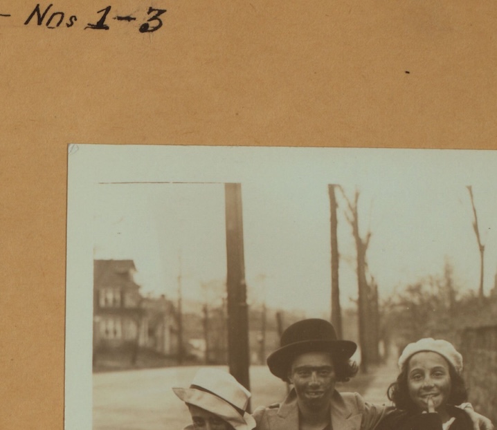
The 90-year-old photos I used for yesterday’s post looked pretty good, right? Here’s one of them

Now here’s the source file from the New York Public Library:

Before I used this, I cropped the NYPL image to each of the three actual photos, decreased the color saturation to make them more-or-less grayscale rather than sepia, increased the contrast, and overall lightened the image. I think it looks pretty good, and I’ll argue that what I’ve done os to make the image conform better to modern expectations for a photo. There is no information in the first image that’s not there in the second – except maybe some meaningless artifacts introduced by my tampering. It’s just easier for our eyes to see.
Note that the same issues exist whether I am using a photo that I took or someone else in the office took, or photos from a public source like the NYPL or Library of Congress. Most of the time, the thing you want to focus on is only part of the whole, and the lighting is often not as good as it might be. Which is why when I take photos for use in a report I save the unedited originals along with the copies I’ve altered (contrast, lightness, or adding circles and arrows): the originals have the most original information.

You must be logged in to post a comment.