
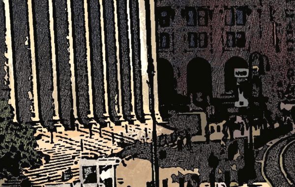
In 1922, the architect Harvey Wiley Corbett commissioned architectural renderer Hugh Ferris to illustrate how you might develop a skyscraper’s overall shape from New York’s 1916 Zoning Law. Starting with a large lot – one filling a midtown block – the first drawing showed the absolute maximum bulk allowed by zoning. The second drawing showed that bulk with the slopes of the setback planes in the law replaced by setbacks and vertical facades, and with light-courts cut into the sides to make sure that the interior had well-distributed light and air in those pre-a/c, pre-fluorescent days. The third drawing, as seen above, showed the very small floors and setbacks removed, to create commercial viable floor footprints. And the fourth drawing showed that blocky mass ornamented with little Roman temples. Unsurprisingly, the third drawing is the most famous.
There were a number of assumptions built into Corbett’s and Ferris’s work, because at the time they were no buildings like this in existence. The skyscraper boom of the 1920s changed that, as a number of very tall buildings on large lots were constructed in New York that had to follow that zoning. One aspect of the zoning is critical to understanding why the final buildings didn’t quite resemble the speculative rendering: the law had no maximum height. Once setbacks reduced the floorplan area to 25 percent of the lot area, the building was allowed to go up as high as the developer wanted. The Corbett/Ferris design tops out around 55 stories when it could be taller, which is not the way that skyscraper history went.
Here’s the building that most closely resembles the Corbett/Ferris design in terms of its lot and external conditions, the Empire State:

If you look at the base, you see the general shape from the rendering. The proportions are off because at the Empire State the main tower got stretched very far once its area was at the 25 percent cutoff. The tallest segment of identical floors have areas right at 25 percent.
The Chrysler Building is on a significant smaller lot, so its 25 percent tower is more slender. The lot is not symmetrical and the building doesn’t fill the block north-south, so the base is distorted, but you can again see the rendering-style setbacks at the bottom, and the tall stretch of 25-percent floors in the middle:

The last building is less well known but prominently placed: 500 Fifth Avenue is at the corner of 42nd Street, across the street from the low-rise public library and thus assured permanent good views from the south. (You can see it off to the right in the ESB photo above.) It was designed by Shreve Lamb & Harmon, the ESB’s architects, immediately before the ESB. It’s only sixty stories tall so its tower looks a bit more like the renderings, but the different in zoning setbacks on the two adjoining streets made the base asymmetrical:

In all three cases, the setbacks and facades are simpler than in the renderings, which made the buildings less expensive to build and to maintain. Also, in real life, windows break up the planes of the facades in a way that Ferris’s charcoal does not, so the smaller detail of the very small setbacks was not visually necessary.
You must be logged in to post a comment.