Another historical toy to play with: the New York Public Library has put a digitized collection of postcards from the Detroit Publishing Company on line. In discussing old buildings here, I have heavily mined the Library of Congress collection of prints from the Detroit company, but this is something else. In the pre-internet, pre-photojournalism days of the early twentieth century, their main business was selling photos of places that people had heard of but might never see. Some are famous spots of natural beauty or the tourist sites in various cities, some are simply views of cities and towns. The prints were high-resolution black-and-white photos in large formats, which are great for hanging on a wall but not necessarily for all purposes. The postcards were modified versions of the prints.
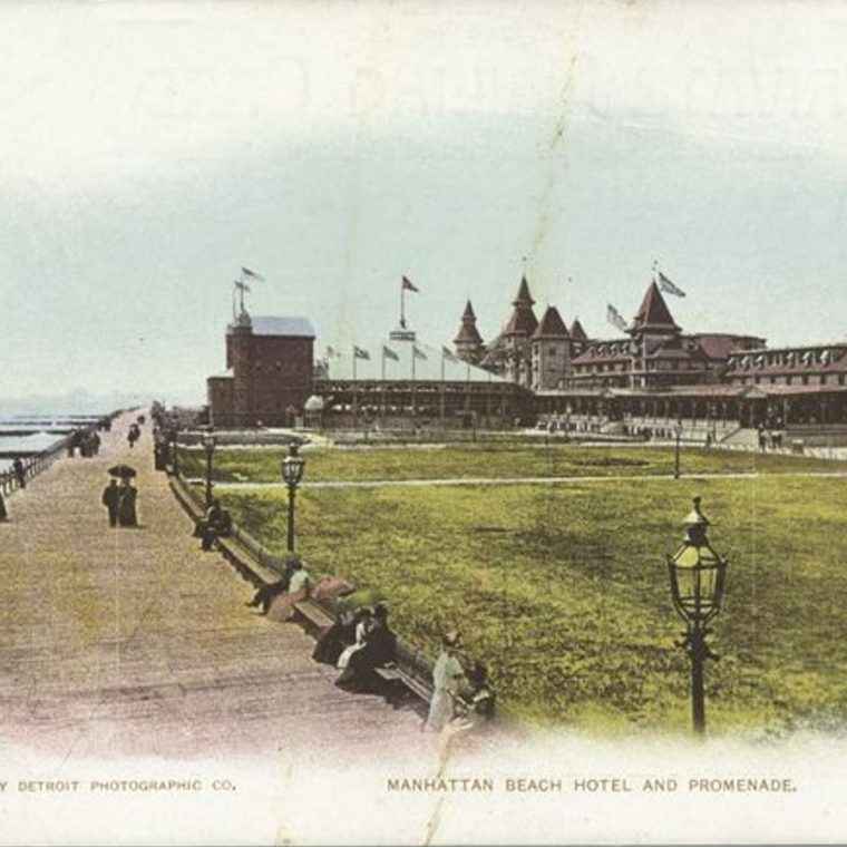
The postcard above shows the Manhattan Beach Hotel, a resort at the southern tip of Brooklyn, facing Breezy Point (the west end of the Rockaway peninsula) and the Atlantic Ocean beyond. Manhattan Beach was developed as a resort at roughly the same time in the late 1800s as Brighton Beach to its west and Coney Island, further west still. The current-day routes of the subway from downtown Brooklyn to the south largely match the railroads built then to carry people from the city down to the resorts.
That colored postcard was created using the Photochrom process, in which color prints were made from a black-and-white negative using a combination of multiple passes of lithography and notes from the photographer as to what colors things should be. In short, the colors are partially speculative rather than being mechanically reproduced. The use of lithography and multiple printings to create an image also meant that fine detail was difficult to get. I couldn’t find the exact print that was used for this postcard, but here’s a similar one:

I reduced the size of that image by 50 percent (so it has one quarter the original number of pixels) to keep it from being too big for our website. Here’s a small piece (the pavilion on the far right) at full resolution for comparison to the postcard:

There’s no debate in terms of detail: the X handrail on the fire-escape on the short right facade, and the decorative gable over the entrance to the one-story building are barely discernible in the postcard view. But…color really does make a difference. The colorized version is more evocative of a resort at the beach; the black-and-white version is more of an architectural study. For my purposes, studying a long-demolished building and its context, the more detail the better, but if I wanted someone to get a sense of that resort from 120 years ago, I’d probably show them the postcard first.

You must be logged in to post a comment.