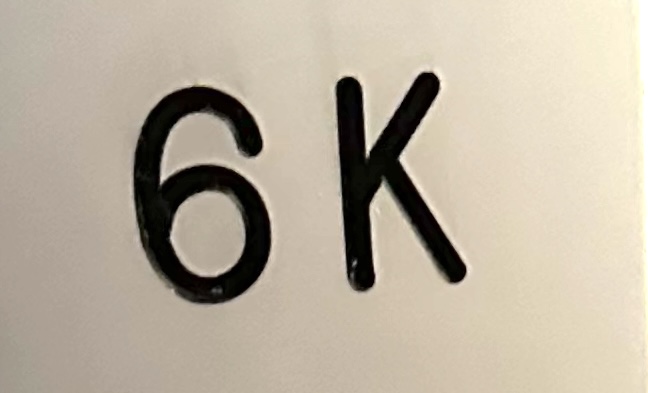

I just spent half an hour reading an essay and going down various side-quest branches from its links, and I strongly encourage all of you to do so as well. The essay is “The hardest working font in Manhattan” by Marcin Wichary.
The topic is a typeface that is sort-of named Gorton, that has a convoluted history, and which is everywhere. In case that seems like an odd topic given my stated purposes in writing posts for this blog, let me say that the essay touches on New York’s built environment (obviously, given its title), on the history of technology, on early CAD drafting, on mechanical aids for hand-drafting, and on heavy machinery.

More specifically, when I started work in 1987, CAD hadn’t yet taken over in private-firm structural and architectural practice. The office I worked in, Weiskopf & Pickworth, was a place where drafters were as necessary to our daily output as engineers. One of the senior drafters was experimenting with AutoCAD on a PC, but every project I worked on was 100 percent hand drafted. For ordinary work, the drafters all lettered freehand (not quite freehand, as most used a straight-edge to guide the baseline, but the letter forms were made freehand). Some of the engineers and some of the drafters had Leroy sets that used templates to guide a pen for mechanically-aided hand lettering. The essay discusses the lineage connecting Leroy and Gorton. I believe there is also a direct link between Gorton and the Simplex font that was one of AutoCAD’s first typefaces.

There’s a reasonably popular framework in the history of technology called social construction of technology. SCOT suggests that inventions, regardless of where they arise, are guided and developed through feedback loops between inventors, manufacturers, end users, regulatory bodies, and any other people of groups that have an interest. Gorton is the first example I’ve come across of a socially-constructed typeface.
You must be logged in to post a comment.