
There are times I almost get why people like the International Style. Clean lines, a nice pretense at rationality (see below), big windows… Most of the time, I get annoyed at its lack of scale (created largely by its lack of ornament) and its lack of visual interest (created by its lack of ornament). But that’s a discussion of taste and therefore an argument that no one will ever win.
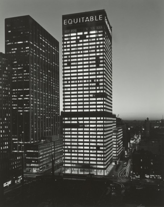
I said a “pretense at rationality” because, as I’ve talked about before, the concept that the architectural appearance will reflect the interior occupancies and structural functions (the latter referred to as “structural honesty”) is, at best, extraordinarily optimistic. (There’s a joke to be made about the boring repetition of the facade elements and corporate office life, but it’s honestly unfair to most people who work in those offices.) Here’s the (sort of new) Equitable Building on Sixth Avenue in 1960:

And here it is again, same era:

The dark band in the second photo about a third of the way up is a mechanical equipment floor. In most buildings, such floors have higher floor-to-floor heights than ordinary office floors; in all buildings they have heavier live loads. Those basic truths are not reflected in the architecture, unless you think the use of louvers rather than windows shows them. As a matter of fact, in the day-lit picture, it’s difficult to find the mechanical floor, which is revealed at night by its lack of occupants’ lights.
The twilight photo is another one where I come close to liking the design, and where the design comes close to actually telling us something about the structure. But close is not good enough. Per Mark Twain, “…the difference between the almost right word and the right word is really a large matter—’tis the difference between the lightning-bug and the lightning.”


You must be logged in to post a comment.